Your readers want information – but they won’t stay engaged if you make reading the text really hard to do. It provides a poor experience and they will probably just abandon it.
Don’t do that to your brand (or your reader)!
Here’s why formatting your copywriting is crucial for content marketing success and how to format your copywriting effectively to maximise results.
Good word choice is NOT the only reason why people choose to read your written content.
It must be formatted well to provide an enjoyable experience too.
Picture this
It’s headline promises a great topic you just need to read. So you click, only to find a WALL OF MESSY TEXT that instantly makes you feel exhausted.
It could be really interesting content that was written by Shakespeare himself – however, you’re not reading it.
Why?
Because it’s too intimidating. You panic at the sheer cluttered volume of text and decide to simply flee instead.
Don’t put your audience in that situation!!!That’s the power of good formatting
Unfortunately, it’s costing you your precious readers and their attention.
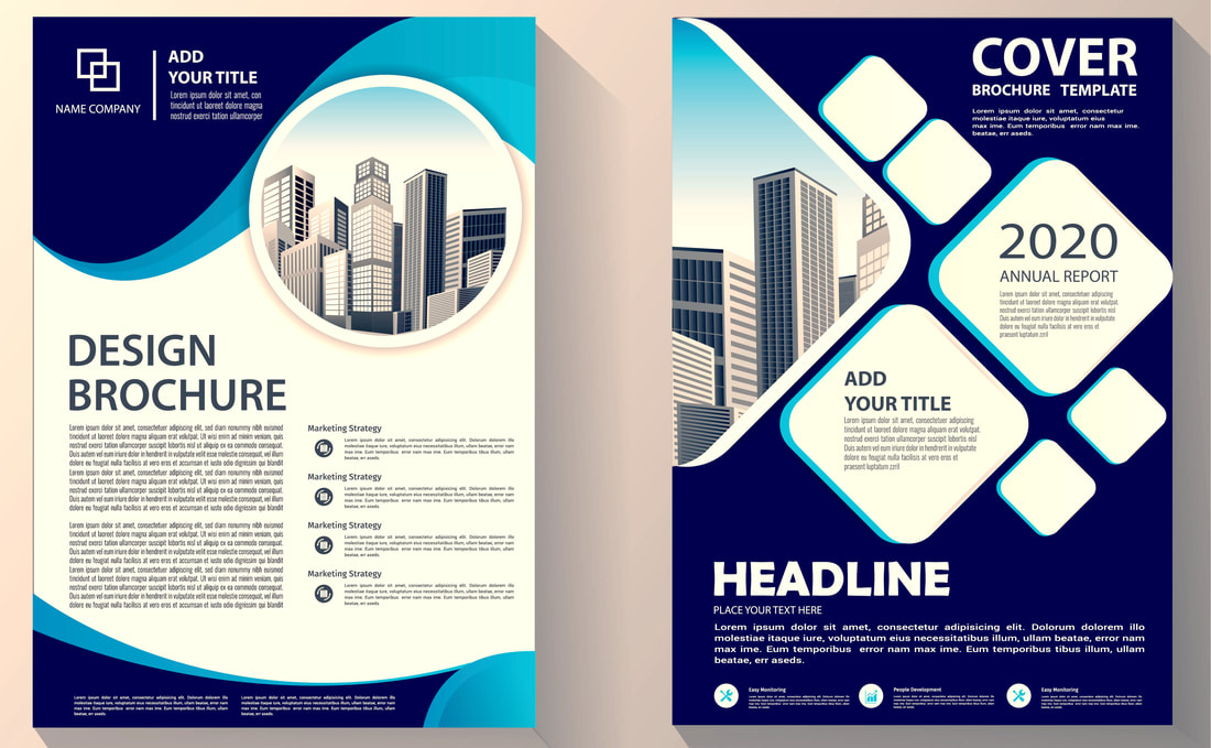
A nice, clean appearance of text, like the template below (or this blog!) makes your readers actually want to stick around.
So, what’s the deal with formatting your copy?
Why, when it’s so important and easy to do? There’s no excuse!
Successful businesses today realise that well-written and high-quality content produces so many essential benefits, including SEO, KOL status, engagement, customer service, supportive materials, and the list goes on and on.However, you can spend hours crafting the perfect content, developing the right tone of voice and devising the best strategy, yet completely ruin it all with poor formatting!
Your words won’t make an impact if people aren’t reading them – plain and simple.
This is where a quality freelance copywriter can help you.
Poor formatting may be costing you your precious readers and their attention.
What’s the lesson here?
Your reader is human, very busy, highly distracted and looking for information that is relevant- don’t make it any harder by making it difficult to read, too!
Don’t intimidate your reader with slabs of text, poor grammar or displeasing structure.Instead, make your content easily digestible and a pleasure to read. Sentence fragments, one-sentence paragraphs, beginning with conjunctions and ending in prepositions are all fine, even desirable if it makes it appealing.
Make your reader actually want to read
With the flood of content online, shrinking attention spans, and skimming readers, if your content doesn’t have eye appeal, it won’t get read or shared. This means that you’ve wasted your time.
Also, think of your audience- they may be reading your piece on their phones, on the move, or between meetings. If you want to earn their attention, then think carefully about the structure and the way your content is displayed on a page.
People today like to skim to parts of your copywriting that they want to read. Don’t fight that! Cater to it, as it provides them with a better experience.
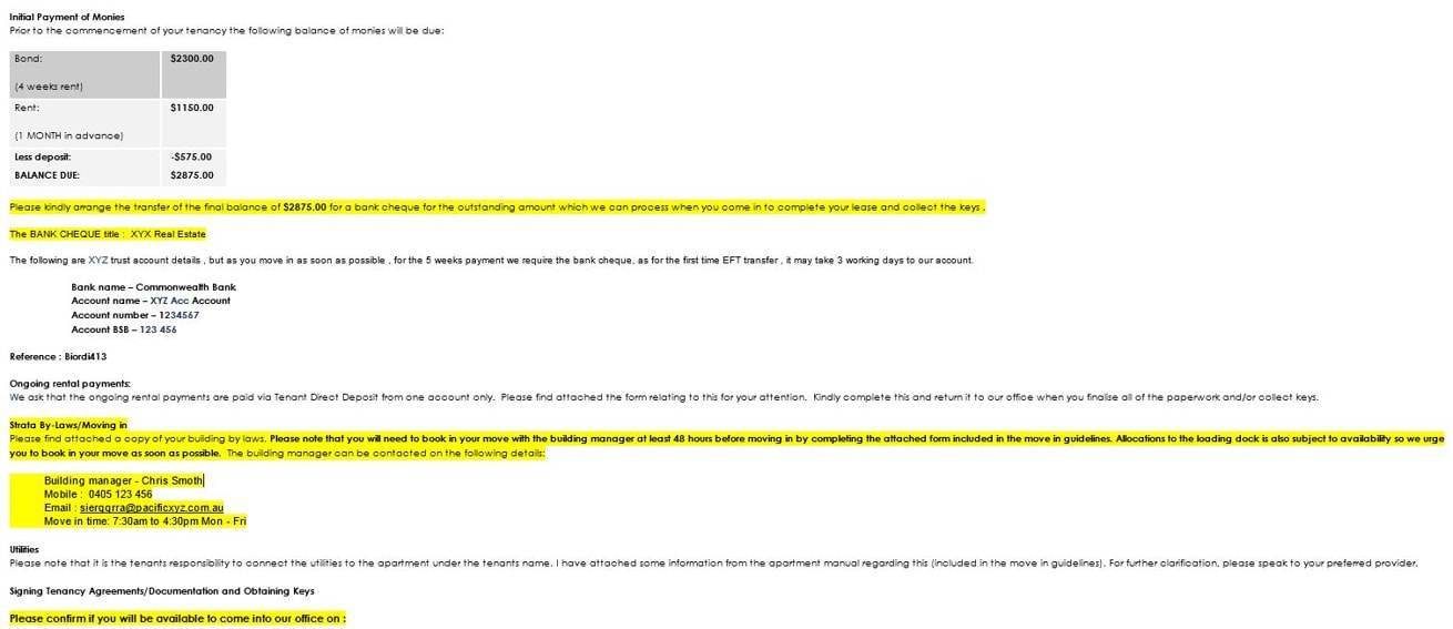
An example of bad formatting
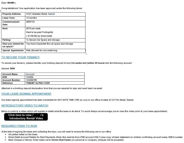
An example of good formatting
So, how do you give your copy the eye-appeal you need?
9 tips to improve your formatting
People love bite-sized chunks of text to read, rather than large blocks today. So, use headings to break your paragraphs up and allow them to skim to the parts they want to read.
(2) Left aligned is more comfortable for English readers
Never NEVER EVER use justified text. It’s really unnatural for readers as it varies all the natural distances of your text. Stick to left aligned or centred formatting.
(3) Use bullet points to give quick snapshots
Your readers will appreciate a list or two in an article because it provides some needed relief that they can focus on to get some quick tips or insight.
(4) Call outs and quotes break up the content
See those bold, grey snippets I’ve included throughout this blog? They’re done on purpose to break up the format, to provide something more exciting for the reader.
(5) Use supportive photographs
Embedding text, video and even Podcasts in between the text is a good way of keeping people engaged – just so long as they relate to the content subject, of course.
(6) Keep general uniformity, so it’s not difficult to read on the fly
Your readers are time poor. That means they are scanning the page quickly for value. Don’t make the copywriting look like a train wreck.
(7) DON’T disturb readers with annoying pop-ups
Don’t place adverts and annoying pop-ups in the way of them reading. It’s completely counterproductive and frustrating!
(8) Check all grammar and spelling, so that you don’t disrupt your reader’s attention
Nothing makes people “fall out of your message” faster than an error. Proof read and be very careful to not distract them with poor grammar or spelling – it’s hard enough to hold their attention.
(9) Include white-space
As the name implies, white-space is the negative areas of white around your text. Include plenty of it around your copywriting as it feels less cluttered and less intimidating to read.
Remember: formatting matters as much as word choice!
How Can Melotti Media Help You?
Perhaps you’re time poor and spread thin, or writing may not be your expertise.
So, let us take care of your message marketing, copywriting and content marketing needs!
For more information or to speak to a quality marketing copywriter to get the results your business deserves, contact me now at chris@melottimedia.com.au.
Our Message Marketing services can sharpen your words into achieve your goals, today.
Christopher MelottiMelotti Media | Copywriting & Message Marketing Bureau
www.melottimedia.com.au

